November 13, 2025Nov 13 Moderator No. I always like the white helmets, but I think a yellow stripe down the middle would have matched the jerseys.
November 13, 2025Nov 13 No. 11 minutes ago, DrJacksPlaidPants said:I always like the white helmets, but I think a yellow stripe down the middle would have matched the jerseys.Our color pallet is just problematic right now. I'll leave it there because I've said it a million times. These uniforms are fine. They have green and yellow which is nice to see after so much black and white this season.
November 13, 2025Nov 13 No. Is it bad that I dread the fact that we have another year with this set? They're bound and determined to make each week a different look than before, so the hodge-podge of looks yet to come doesn't exactly fill me with excitement. How we can have so many pieces of uniform to choose from, yet lack any uniformity beyond the base looks is crazy to me.But, like everyone always puts into perspective: there's no better looking uniform than a winning one.
November 13, 2025Nov 13 No. White numerals with yellow outline would look better. I hope we go back to LIGHTNING YELLOW next year except a retro maybe once
November 13, 2025Nov 13 No. White helmets at home seems off to me, especially since Minnesota will also have white helmets.
November 13, 2025Nov 13 No. Like every year there are a couple of combos that are really really good, but there are just as many that are just not appealing. I would say the use of black should be restrained a bit, white is fine on the road, but it doesn't really work at home imo.
November 14, 2025Nov 14 Moderator No. Personally, the uniform couturiers seem to be reaching for something beyond their grasp, and now better exemplify the old MKA slogan, ‘Deep in the Woods’. When you don’t know what you’re doing anymore, good time to get back to basics: simplify. Edited November 14, 2025Nov 14 by Washington Waddler wrong word
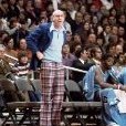
November 14, 2025Nov 14 No. I didn't love the uniforms at first, probably because A'mauri Washington isn't the best fashion model. (He looks exactly the way you want him to look-like a trench warrior ready to do the dirty work!) But after seeing the video reveal, I'm convinced the helmets look bad butt (Pic 1). And I do recall, you can win big games wearing white pants (Pic 2)Go Ducks! Edited November 14, 2025Nov 14 by Chas Man
November 14, 2025Nov 14 Moderator No. I'm not the target audience. I'm not the target audience.I'm not the target audience.


Create an account or sign in to comment